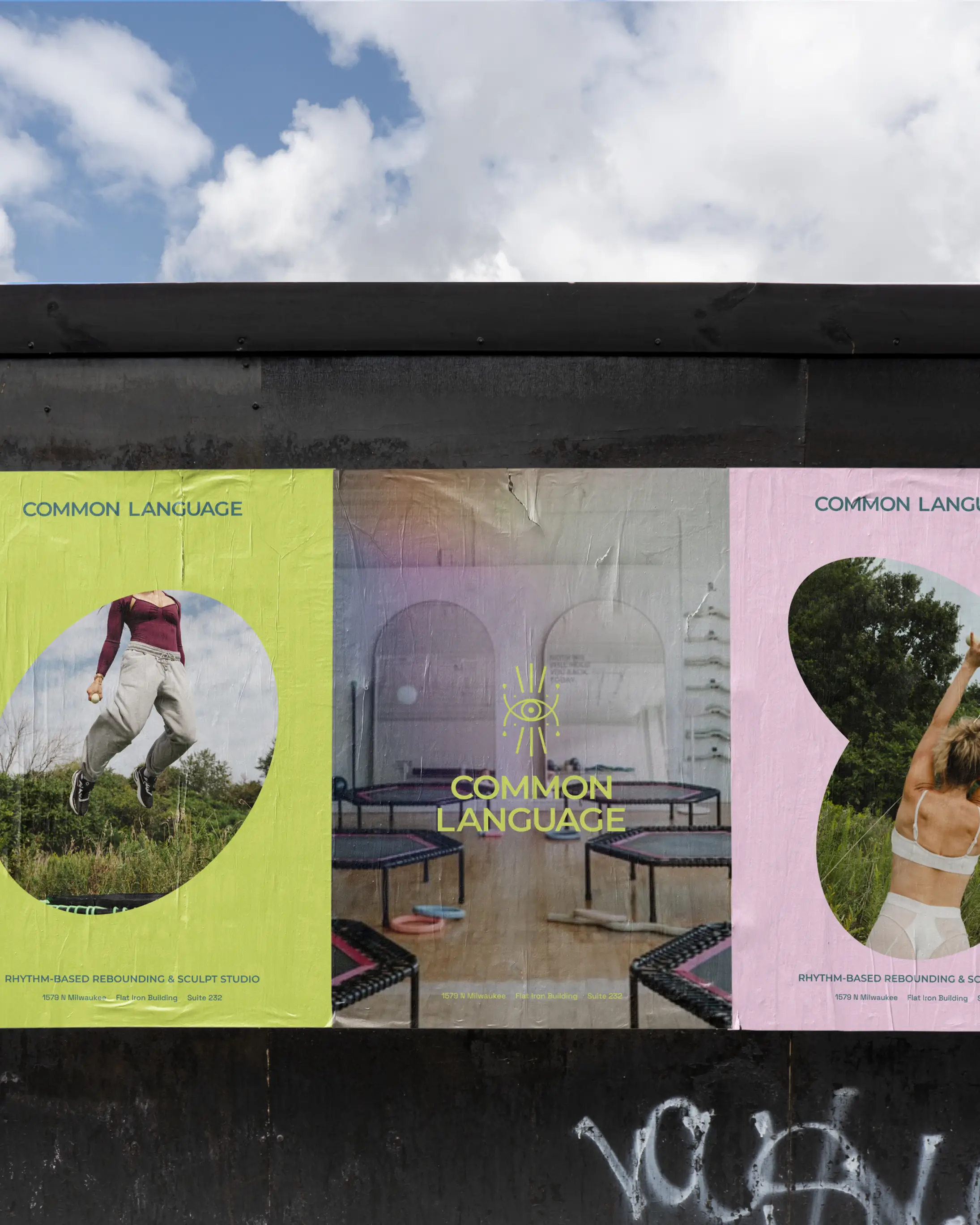
Common Language
Common Language partnered with Isla Luna Studio to refine the brand identity behind its music-driven rebounding method and growing wellness community in Chicago. Known for its high-energy, dance-infused classes and distinct approach to movement, the studio had already built a loyal following before partnering with Isla Luna to create a more cohesive brand system and digital experience. The project centered on translating the feeling of a Common Language class into every touchpoint — vibrant, elevated, and deeply connected.
Location
Chicago, IL
Project Scope
Brand Strategy
Visual Identity Refresh
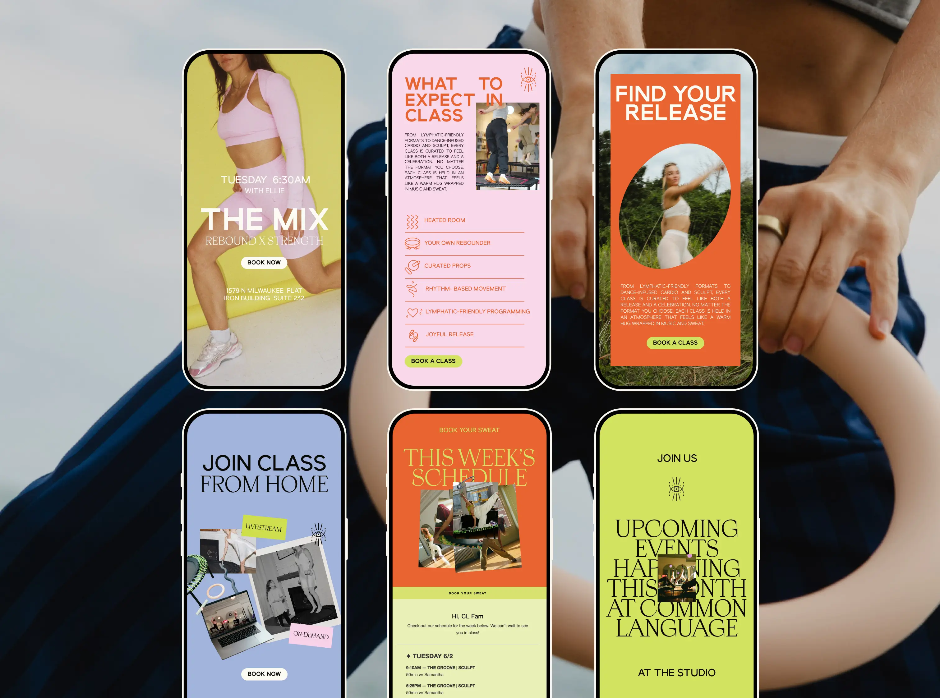
Website UX/UI
Social Templates
Brand Equity Photoshoot
Basic Website SEO
The Challenge
Common Language had something rare: a genuinely unique concept, a loyal community, and a founder with real vision. What they were missing was a brand that could match all of it.
When they came to Isla Luna Studio, the business was operating without a cohesive brand identity to anchor it. The class offerings had grown scattered, class times were inconsistent, and the booking process on their website was creating friction for both new and returning clients. For a studio built around the joy of movement, the experience of finding, booking, and understanding their classes felt anything but joyful.
Rebounding is still an emerging practice — and while the energy inside the studio was electric, the brand wasn't communicating that magic to the outside world. New clients, especially beginners, were left confused rather than curious. Common Language had incredible bones. What this health and wellness client needed was clarity, cohesion, and a brand experience worthy of the studio experience itself.
Our Impact
Our goal was never to reinvent what made Common Language special; it was to bring it into focus. The logo stayed. The method stayed. The energy and the ethos stayed. What we rebuilt was everything around it.
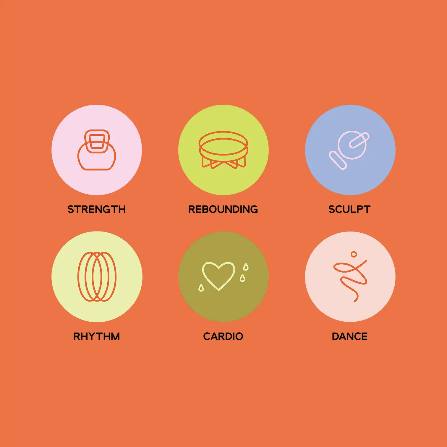
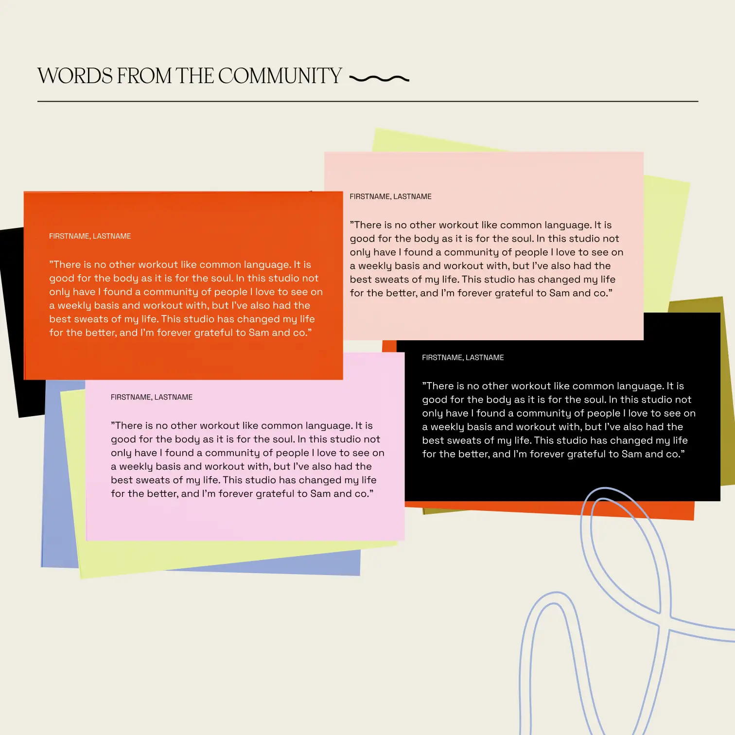
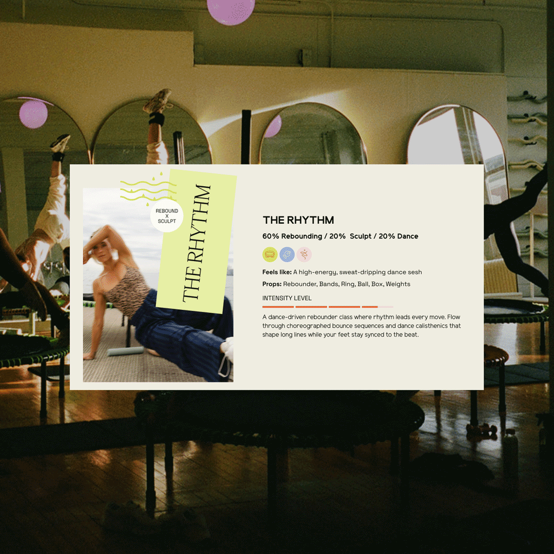
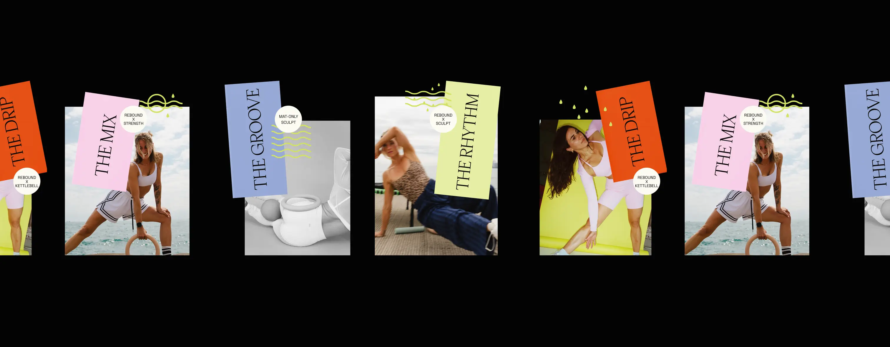
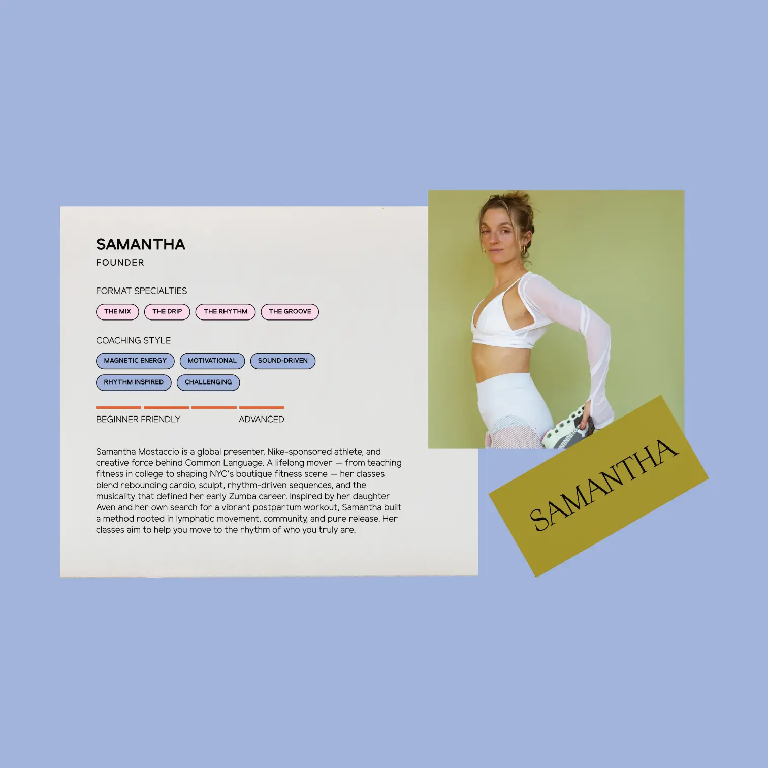
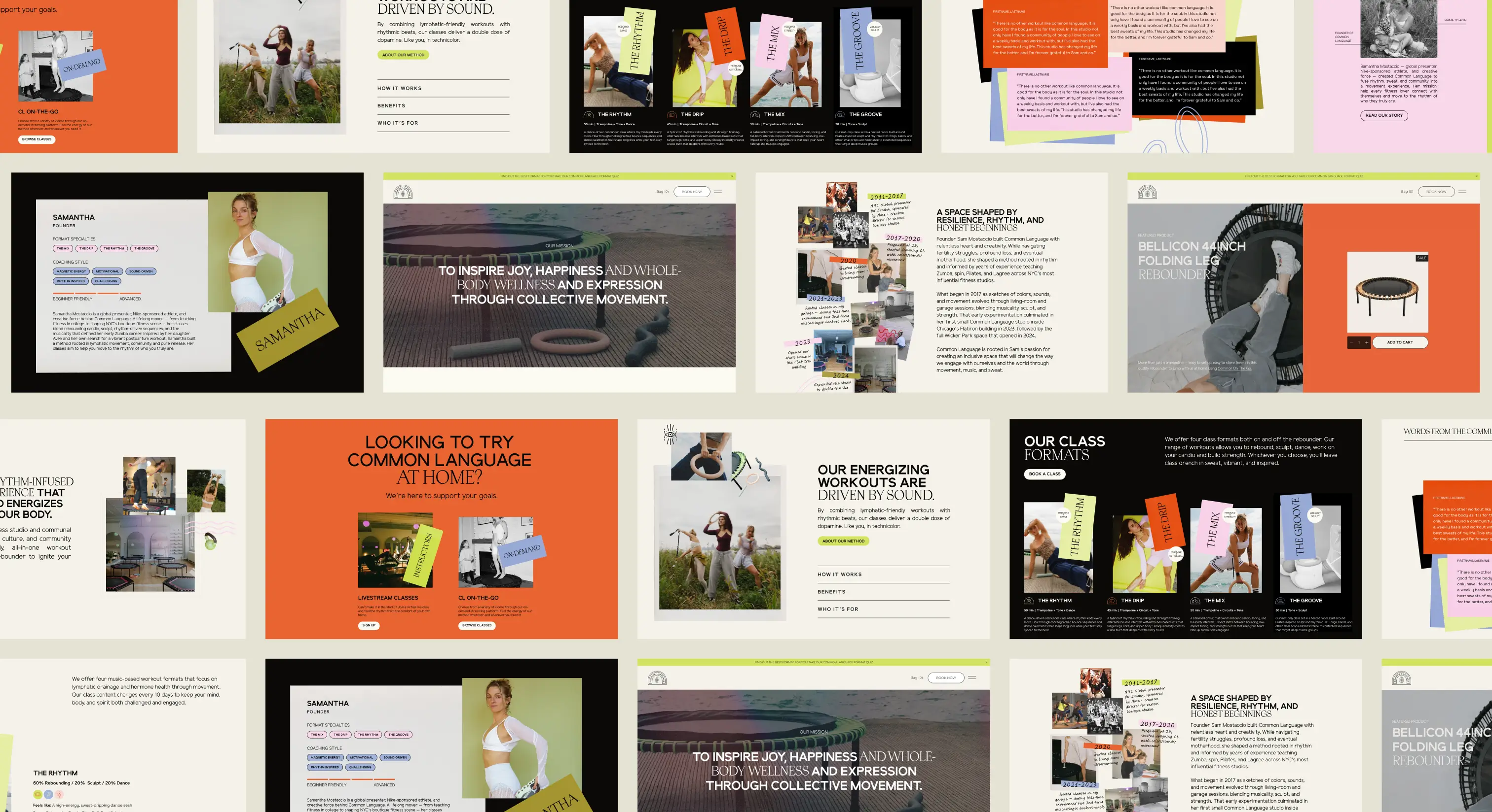
Isla Luna Studio led a comprehensive brand refresh and full website redesign and development. We refined the color palette and typography system, rebranded the class formats for clarity and consistency, expanded the brand's iconography, and developed a refined messaging framework and voice guide that captured exactly how Common Language speaks to its community — warm, uplifting, spirited, and science-backed without ever feeling clinical or intimidating.
The result was a brand system that didn't just look better. It worked better — for clients navigating the booking process, for beginners trying to understand what rebounding even is, and for the founder trying to grow her business without getting lost in the weeds of day-to-day communication.
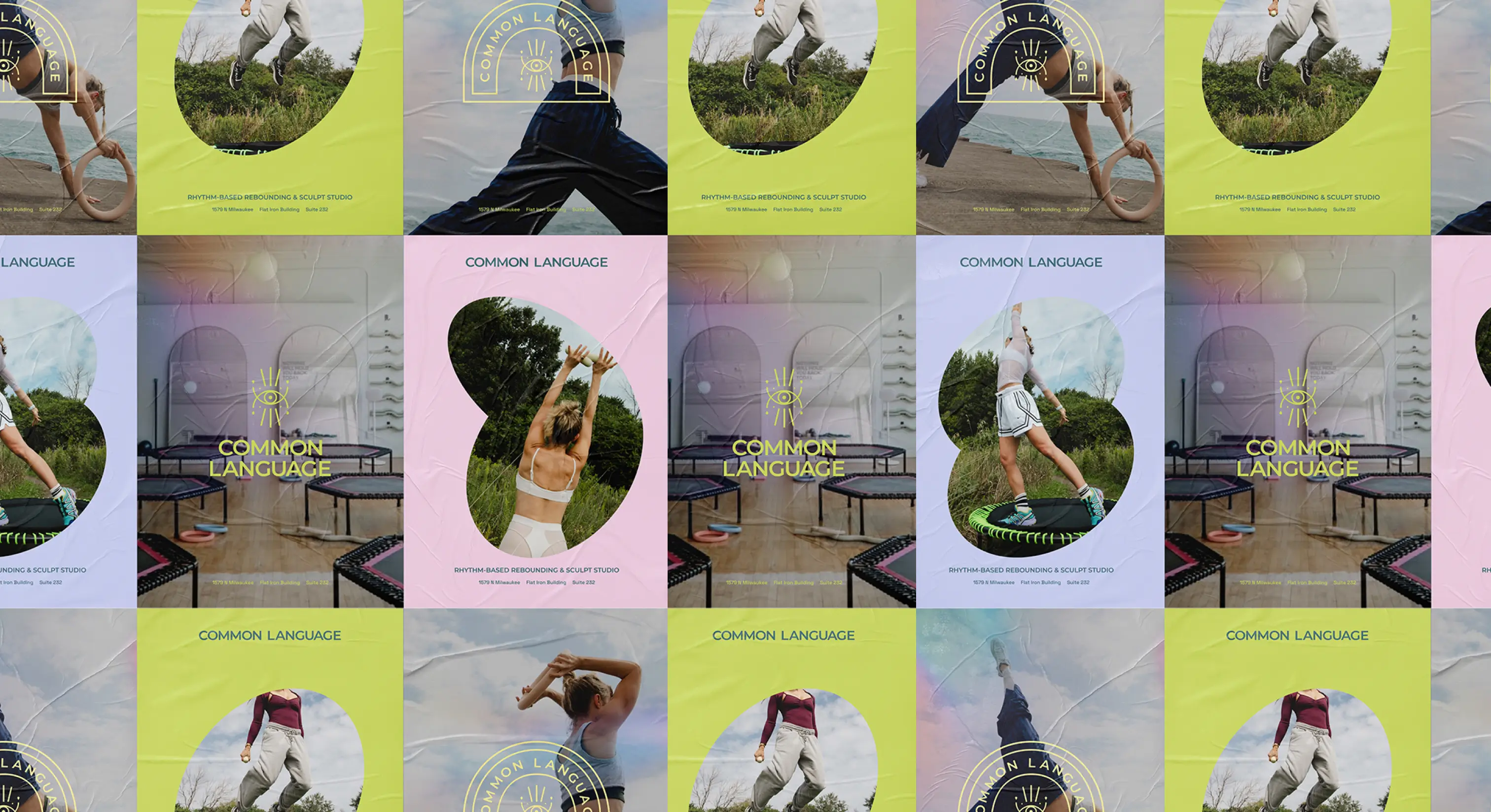
Building the Brand
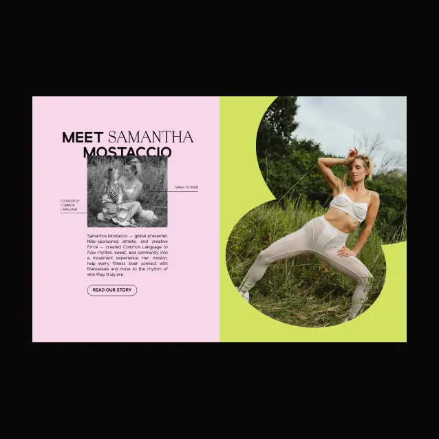
The creative direction for Common Language lives at the intersection of science and soul. Visually and verbally, every touchpoint was designed to feel like a warm, colorful embrace — one that communicates energy and playfulness while maintaining the polished, elevated aesthetic of a true luxury wellness brand.
Typography was approached with the same intentionality as the workouts themselves: clean, modern, and athletic typefaces grounded in clarity and luxury paired with expressive, high-impact display fonts that bring movement and energy to every headline. Bold contrasts in weight, scale, and spacing create a visual rhythm that feels as alive as a class at the studio.
Photography direction leaned into the bold, unapologetically fun spirit of Common Language — bodies in motion, flash and film layered with texture and light flares, sweat and expression captured in a way that feels both elevated and experimental. The kind of imagery that doesn't just show what a class looks like, but makes you feel it.
And at every level, the copy was shaped to speak directly to the woman who's been waiting for a workout that finally feels like her — motivating without being aggressive, science-backed without being cold, and always, always inviting.
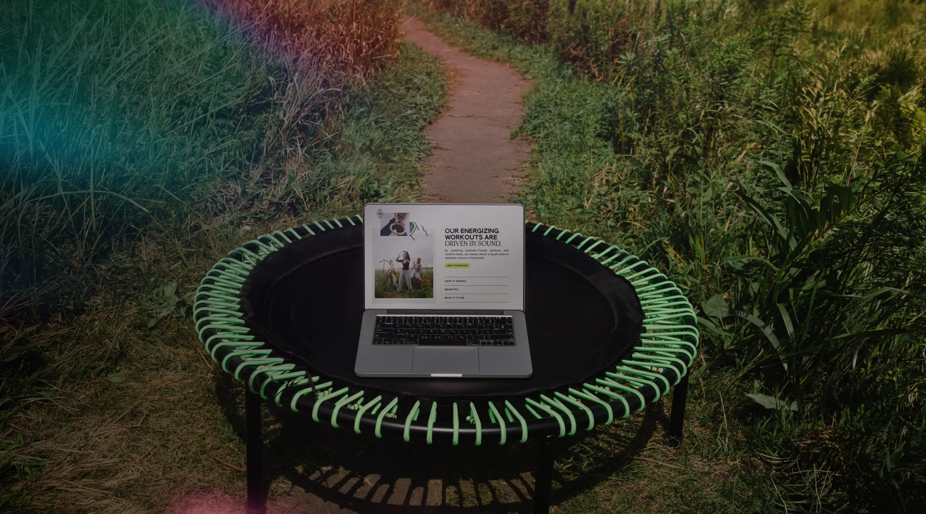
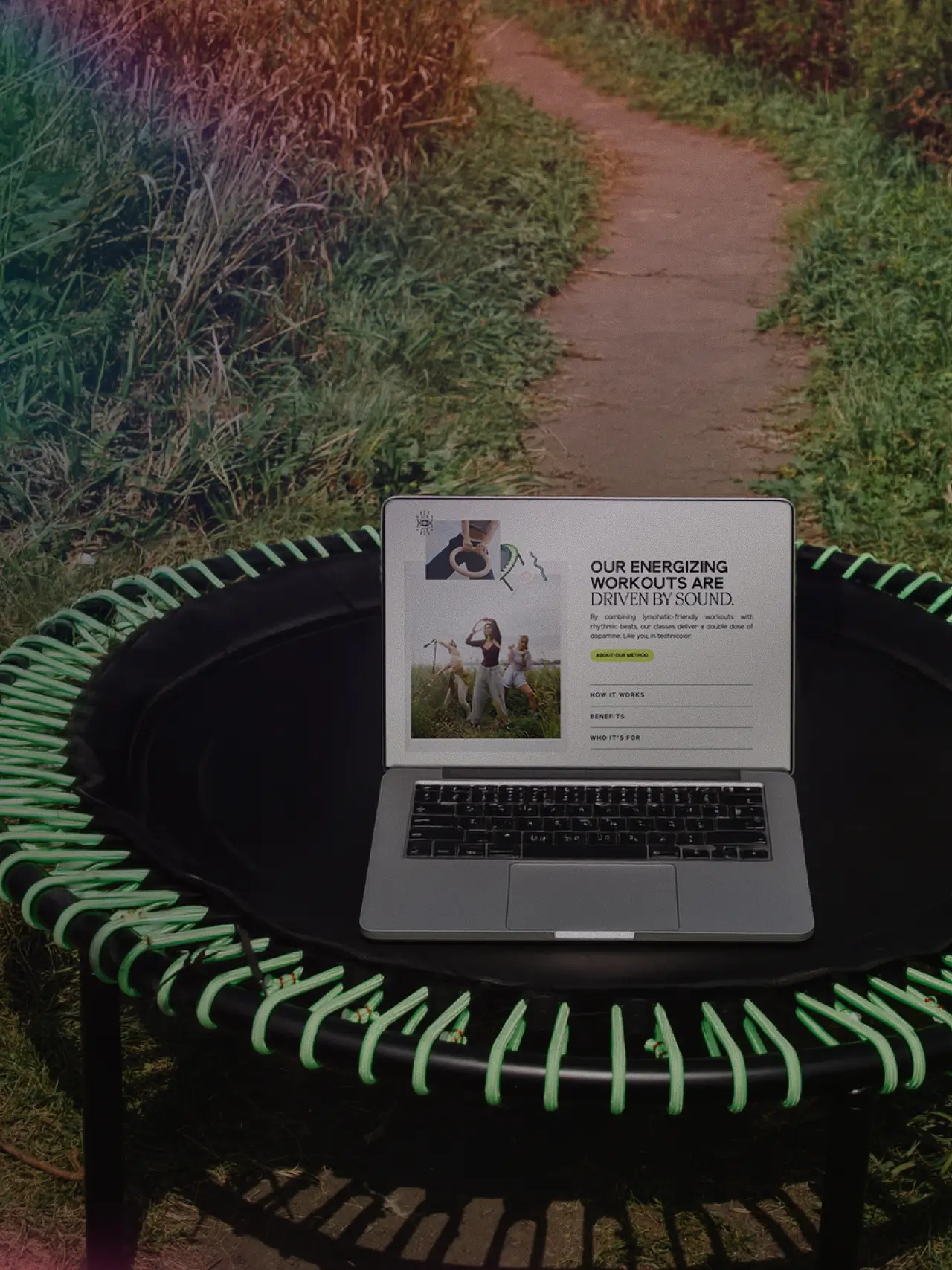
Creating a Refreshed Online Ecosystem
The new Common Language website was built to do what the old one couldn't: welcome you in, make you feel something, and get you booked without friction.
The information architecture was restructured to reflect the rebranded class formats clearly, so that a first-time visitor — especially someone new to rebounding — could quickly understand what to expect and feel excited rather than overwhelmed. The booking experience was streamlined, and the overall site was designed to feel as curated and high-energy as walking through the studio doors.
The impact was immediate. Common Language saw a 600% increase in social media growth following the rebrand and launch, alongside a significant increase in class bookings and continued brand recognition in the Chicago wellness space. Perhaps most meaningfully, the clarity of the new brand gave the founder the mental space to step out of the weeds and focus on building her business — not just running it.
Credits
Photography
Julianna Pressley
Videography
Kemp Films
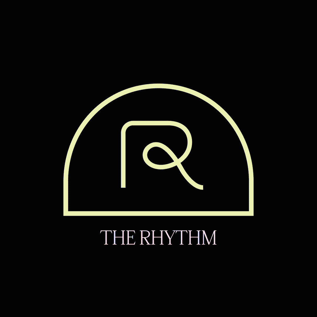
Logo & Original Icon Designs
Liz Grant
Related Projects
Good things, straight to your inbox
Stay in the loop on Isla Luna Studio news, a peek behind the scenes, and more.